A new restaurant and café had to feel established and premium from its opening day, in a town full of look-alike cafés. The brand needed to work on foil, fabric, wood and glass.
What we saw
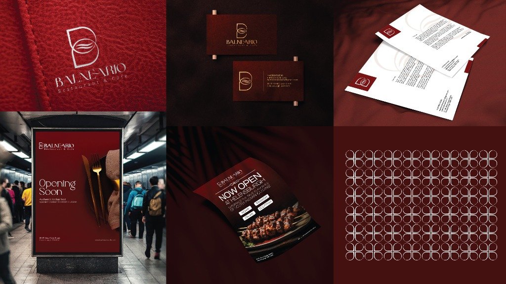
“Balneario” evokes a place to unwind by the water. The curve of steam rising from a cup and the curve of a wave are the same line — and both sit naturally inside a B.
The solution
How the idea came to life.
A B-monogram where steam, waves and a coffee bean meet — with four hidden meanings: the letter B, waves, a hot plate and a coffee mug.
Gold foil on wine red, espresso brown and stone grey for instant premium cues.
Rolled out across the storefront, placemats, uniforms and the interior.


 Chat with us on WhatsApp